Re-Creating shapes using Stippling
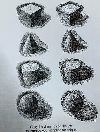
I did this exact same stippling activity last semester and I think
that the way it turned out was that the practice helped me a lot because it they turned out looking the same.
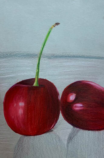
PRISMA CHERRIES🍒 |
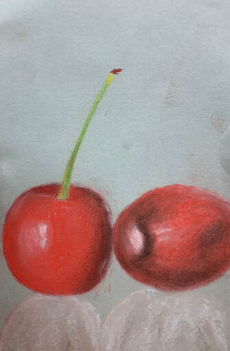
CHERRIES USING CHALK 🍒 |
|
|
|
I chose cherries to draw using prima color pencils.
I used a dark purple and a hint of black on the darker spots were the original cherries has the shadows and the highlights. Overall I think that the cherries turned out pretty good. |
In the beginning it was quite difficult getting the hang of using chalk
because I was adding the chalk so heavily. But then when I started to shade in the cherries lightly the chalk started to blend thoroughly and evenly. |
Pen & Ink “Lost In Wonderland”
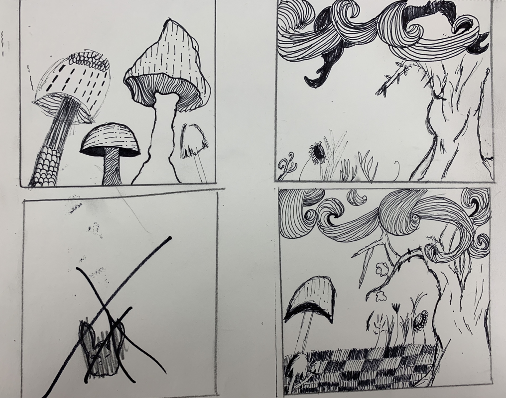
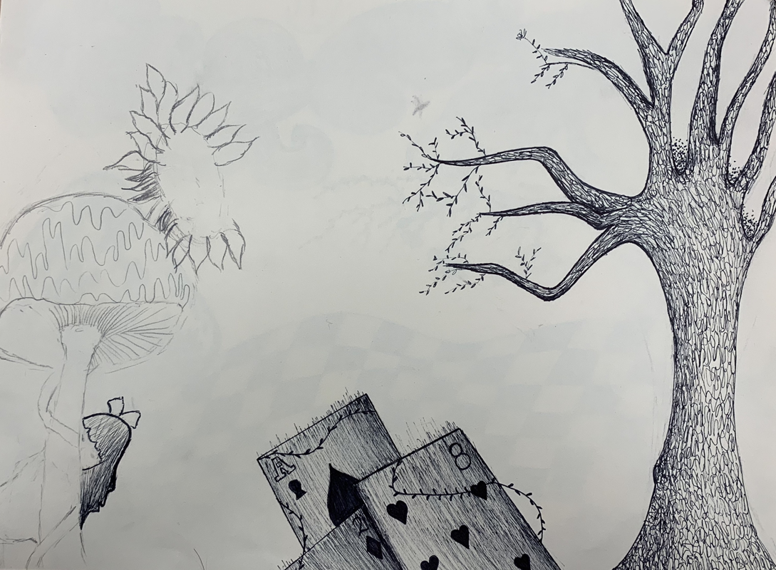
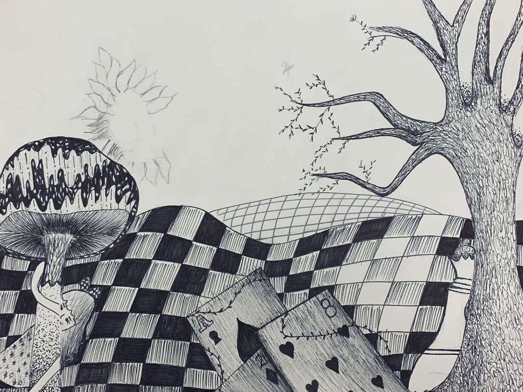
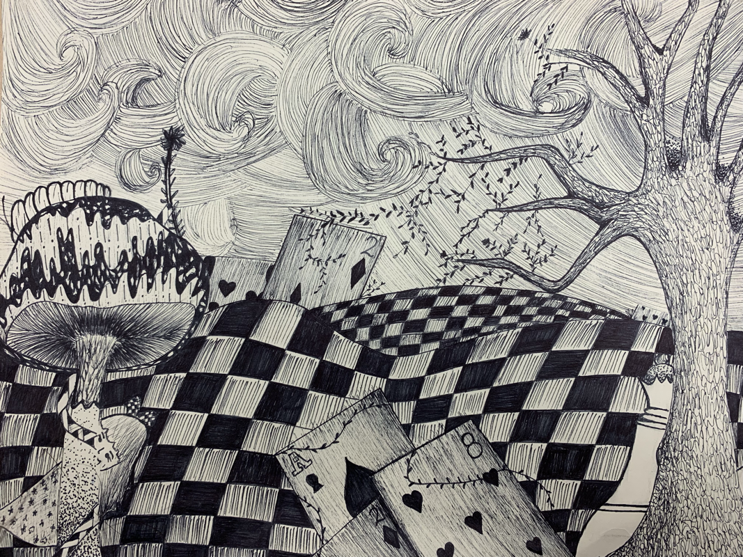
- Describe how you arranged your composition. Discuss your use of the elements and principles. Is it a successful composition? The way I arranged my composition was planning first what patterns I'm going to add and as well the shadow and value. Adding value to the tree and deck of cards gave the drawing more realistic view.
- How is texture and pattern important in your composition? Pattern and texture is important in my composition because it makes it pop more as well as adding value to it. Adding different patterns that go together makes the composition flow.
- Why is value so important in this project? Value is important in this project because it adds form to the drawing. Adding different ranges of value helps make the objects look more dimensional and making the drawing more realistic.
- Describe your craftsmanship (How well the project is crafted technically). The way I executed craftsmanship in this project is focusing in the details of the patterns where they flow much better. Not adding so many patterns doesn't make the drawing so busy.
- Explain how your knowledge and creating practice studies with value and pattern contributed to the success of your piece. Practicing with the different ranges of value and patterns helped my drawing successful. Applying heavy stippling in areas that need to be dark helped a lot.
- When applying the pen and ink/pattern techniques why and how is it important to make sure you understand the concepts taught in class? It's important to understand the pattern techniques taught in class because it helps you plan out a better picture of what you are going for. As well having a better understanding of where you can apply the patterns and value.
- As a growing artist how do you think what you have learned will guide and better your future projects. Explain. I think that what would guide me to better and successful projects might be practicing first.
- If you could recreate your piece what would you do differently to enhance your final outcome? If I could recreate my piece I would add more shade and value to parts that needed it and as well as adding different patterns.
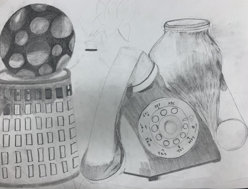
During this project I liked how it was turning out but I didn’t quite finish it. It was difficult drawing the basket and trying to make the jar look clear and transparent. Adding value to certain parts made the drawing flow together making it more realistic
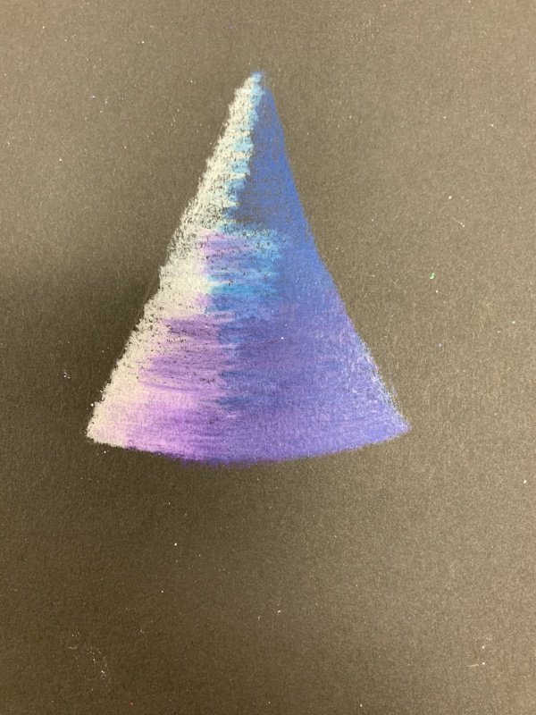
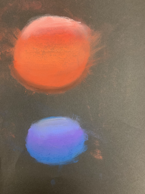
Shapes w/ different color tools
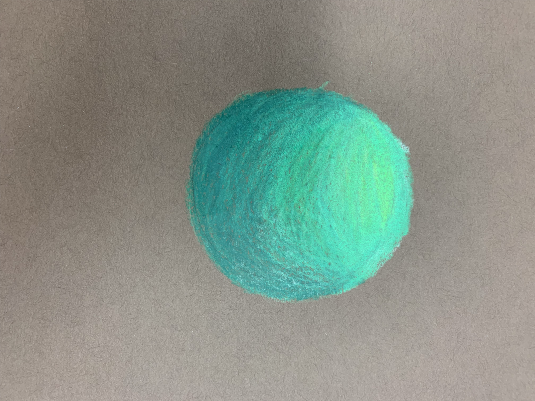
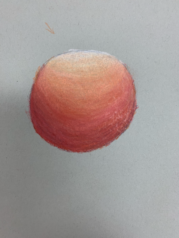
Each individual shape was done with the same tool. Prisma color pencils I always have a hard time using this technique. But I tired my best and they didn’t turn that bad. I forgot to add the shadow so it could have made the shapes more realistic and would of added value as well.
These 2 shapes were shaded using chalk.
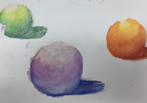
I used watercolor pencils for the 3 shapes. The value of the shapes didn’t turn out how I wanted to, it wasn’t that difficult using watercolor pencils because you shade where you want it to be darker just like a regular color pencil.
Candy Drawing
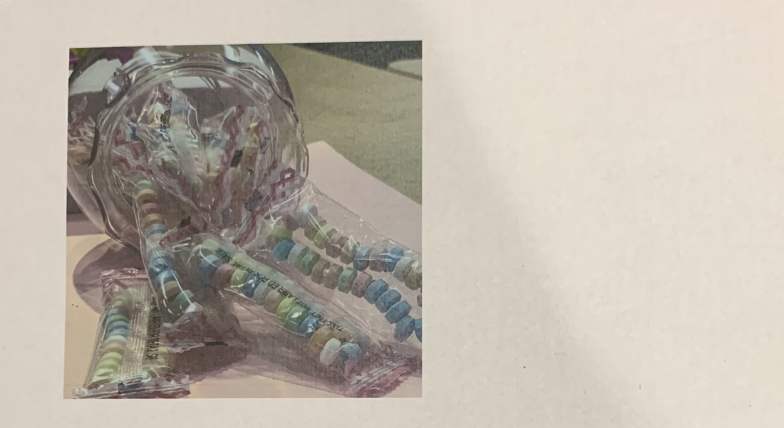
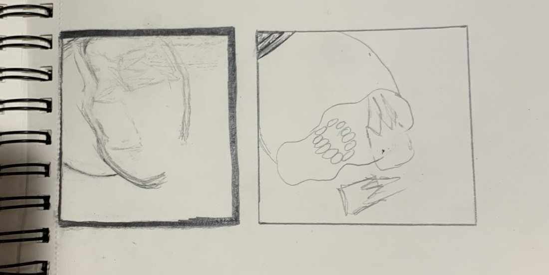
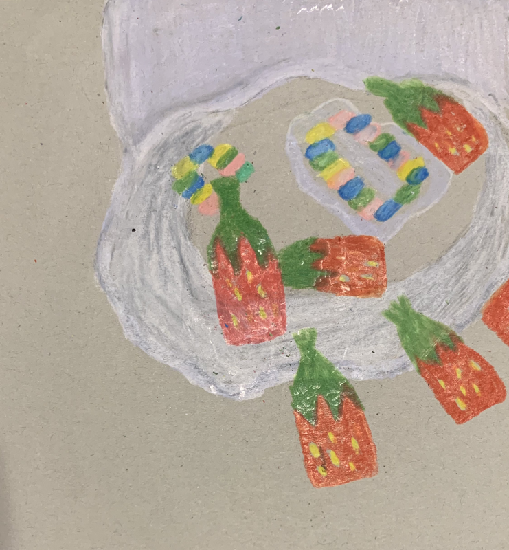
My craftsmanship lacked in this drawing I didn’t give it my best and I didn’t finish the drawing. I feel like it needed more depth and value to it. I always have a hard time with prisma color pencils and I feel like trying to manage the color blending was the difficult part.
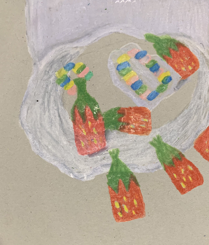
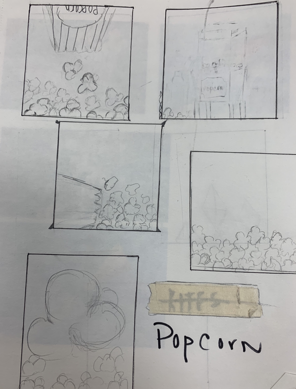
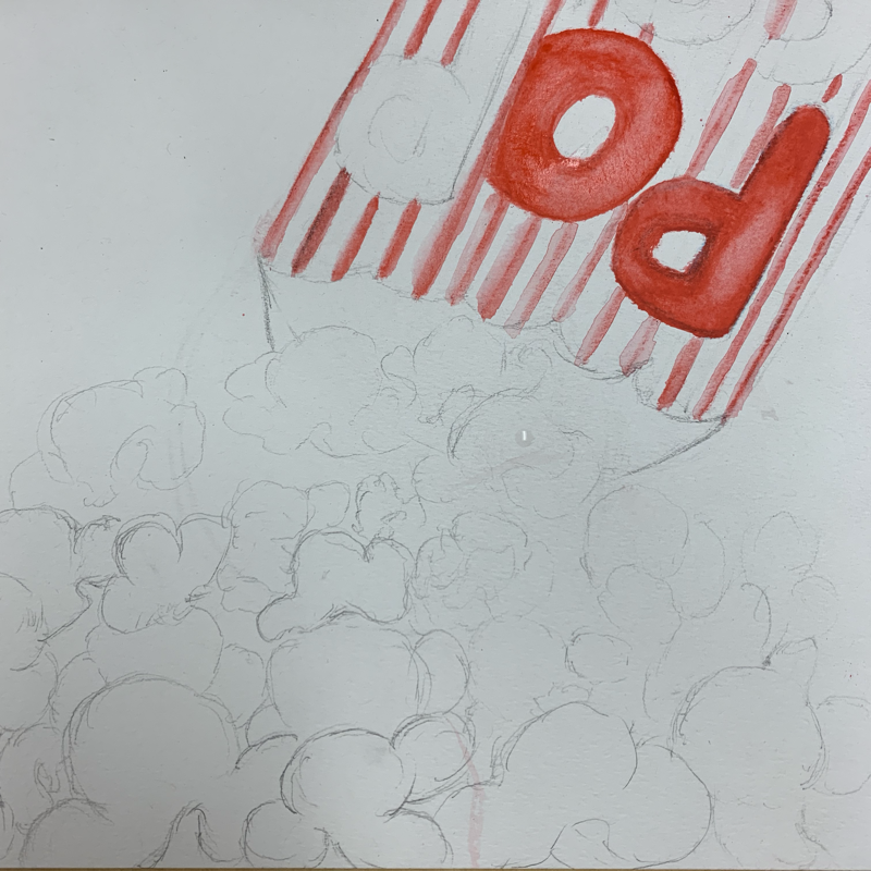
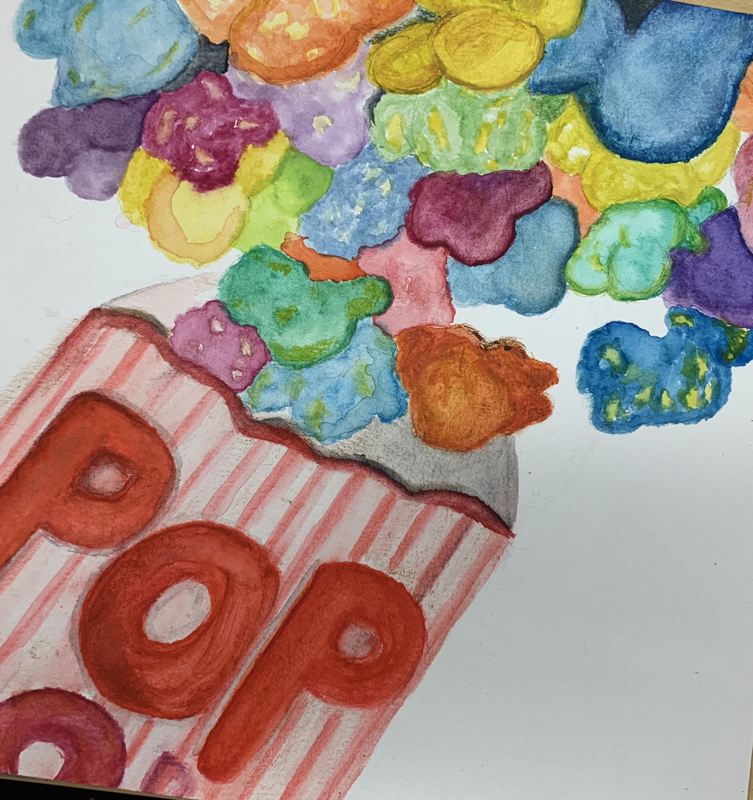
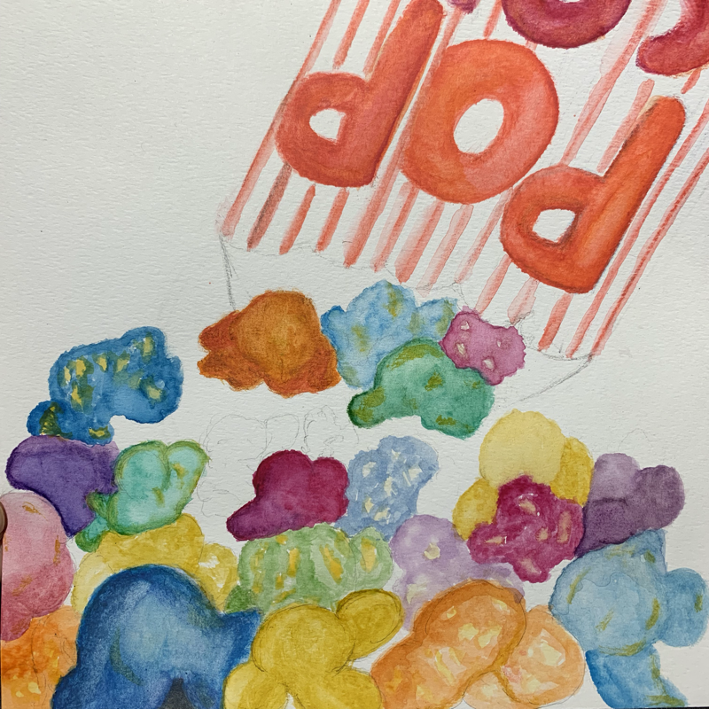
Repeated Item
1. Describe how you arranged your composition. Discuss your use of the elements and principles. Is it a successful composition?
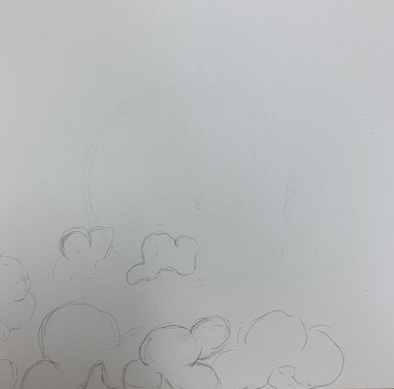
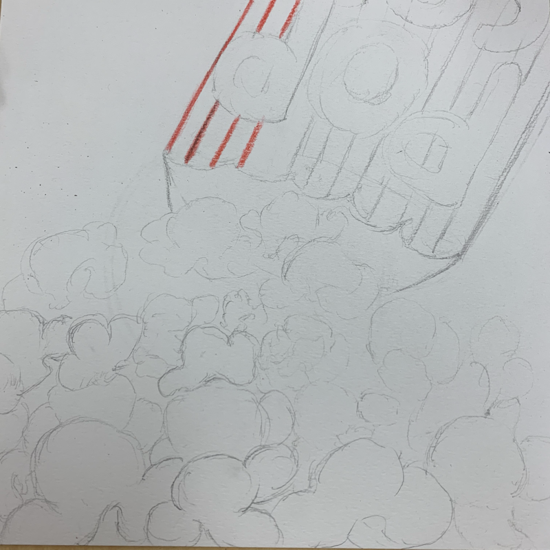
The way I arranged my composition in the patterning project was knowing exactly where to add value and color to my drawing. I used watercolor and watercolor pencils. I tried balancing the colors since the popcorns are repeated colors. In my opinion I feel like the composition wasn’t that successful because I feel like it needed more value to it.
2. How is texture and pattern important in your composition?
I feel like texture and pattern is important in my composition because it adds shape and value to the composition making it flow. The more texture the drawing as the more quality I feel like it adds to it.
3. Why is value so important in this project?
Value is very important in the project because It adds shape to the project. Adding different combination of colors to the composition makes it more realistic.
4. Describe your craftsmanship (How well the project is crafted technically).
The craftmanship I presented in this project was not well executed. I used the watercolor properly, but it lacked texture to the popcorn. This project was not quite crafted technically because I had a hard time using the watercolor pencils and how I arranged the coloring tools.
5. Explain how your knowledge and creating practice studies with value and pattern contributed to the success of your piece.
My knowledge and practicing with value and pattern helped a lot in this project although it didn’t turn out how I wanted it to. But knowing how much value the popcorns needed so it could create its shape. Adding the pattern repeatedly made the emphasis be more in the popcorn rather than on the container.
6. When applying the pen and ink/pattern techniques why and how is it important to make sure you understand the concepts taught in class?
Applying the techniques that were taught in class is very important because you can gather that information that was given to use and apply it to the composition. The outcome of the project will be more in how well we used the tools and principles of value and pattern.
7. As a growing artist how do you think what you have learned will guide and better your future projects. Explain.
As a growing artist I feel like what I have learned will help me towards my future and have a better understanding of how I can plan my project first and know exactly what coloring tool I want to apply to it. Also, I feel like it will help me by knowing how to properly use each principle.
8. If you could recreate your piece what would you do differently to enhance your final outcome?
In my opinion I feel like I didn’t do my best in this project. I feel like I could have done better I didn’t focus and plan very well for this. It lacked craftmanship and knowledge of application of the coloring tools I was using. If I could recreate this piece again what I would do differently is the way I didn’t mange my time well although we had plenty of time, I didn’t give it my max. I feel as if I didn’t add enough texture to enhance my piece.
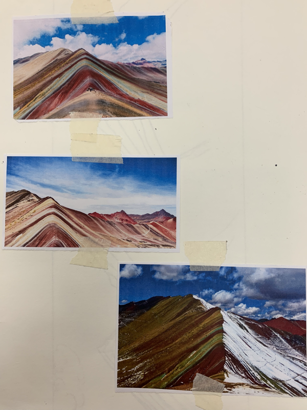
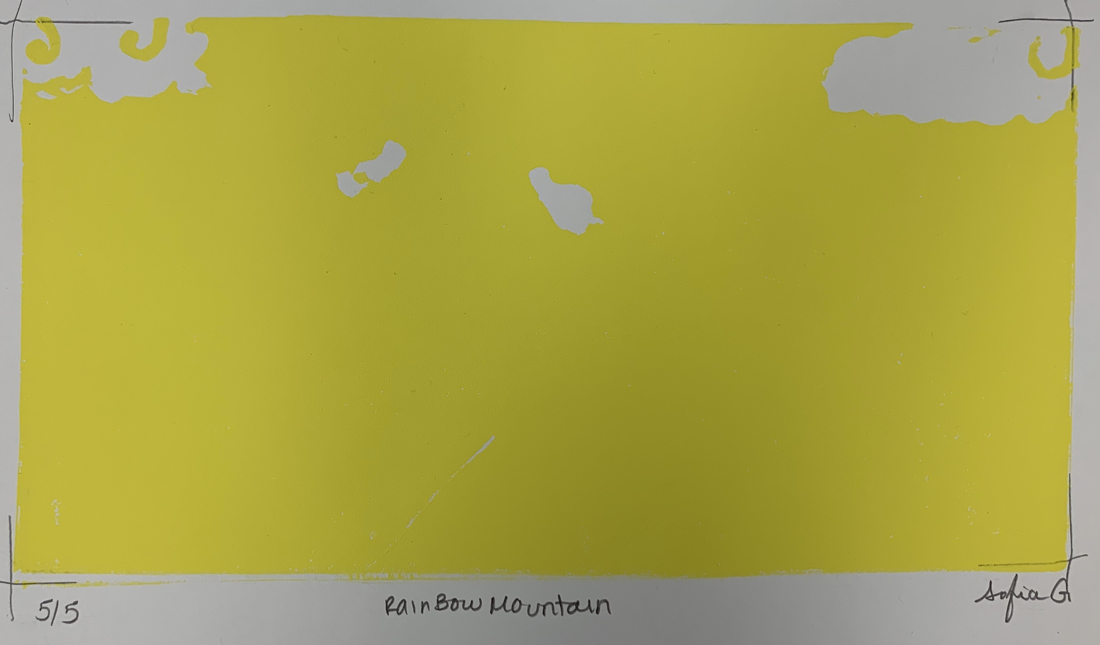
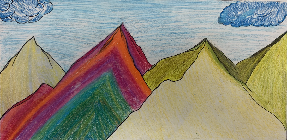
Print Making: "Rainbow Mountain" - Peru
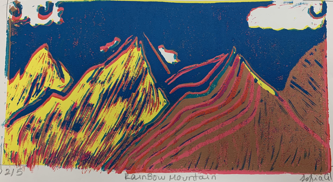
1. Describe the craftsmanship of your prints. (How good the project is technically crafted)
The craftmanship was well executed in this project in my opinion I feel like I did a good job in the craving and adding the different colors to the print. Although I didn’t plan well in how I was going to arrange the different color mountains. I had a hard time aligning the print, but It turned out well.
2. How did you use texture, color harmony and balance to define your choice of subject?
-texture: The way I used texture in the print making was adding dark and light colors where they would pop more.
-color harmony: I used more than 4 colors in my print it was hard at first knowing which color would go where but It all flowed together. The combination of colors made the print add a certain mood to it.
-balance: I didn’t know if I was adding to much lines to my print, but I wanted the mountains to be the emphasis of the whole print. I used balance in the form of adding lines to make the shape of the mountains. I made the print look like it was curvy and adding a horizon.
3. If you could recreate your pieces what would you do differently to enhance your final outcome?
If I could recreate my print making, I would try to focus in the colors more. Adding colors that are softer and more value to the mountains. I would have liked my print to be more aligned and not see the previous colors.
Color Chart
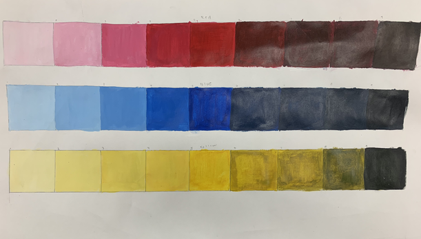
The 3 colors that are going from light to dark are red, blue, & yellow.
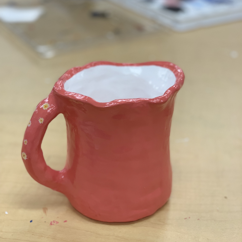
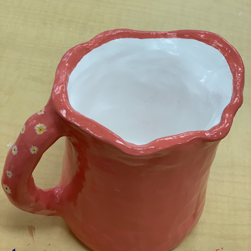
Clay- Pouring Vessel
1. Describe the craftsmanship of your sculpture. (Is it neat and well executed?)
The craftsmanship of my vessel was neat and well executed in my opinion. I had quality craftsmanship in the construction of my vessel. I feel like the shape of the sculpture turned out very good. I added rims to add texture to my vessel. I feel like the color that I chose made the vessel pop more.
2. What was the most difficult part of this project?
I think that the most difficult part of this project was constructing the sculpture. It was so hard because it kept on looking uneven and it wasn’t working for me. So I tried coiling and it worked.
3. Did your color choices work together harmoniously?
Yes, I feel like the color choice I made flowed together. The coral made it pop more and leaving the inside of the vessel white.
4. Is your sculpture interesting from all views?
My vessel does look interesting from all views there’s really nothing to look at because it’s just a vessel but I added flowers to the handle.
5. Describe the differences in constructing a sculpture and doing something 2D.
The difference from constructing a sculpture and doing something in 2D is that it can be based entirely off of 2D sketches opposed to 3D sculpture which comes together only when you make it.
6. How did you create textures in your sculpture?
I created texture by adding value to it. I used the rib tool to smooth the edges and my fingers as well.
7. What would you do differently if you were to do this project again?
What I would do differently is try making my vessel a little taller and adding more details to it.
