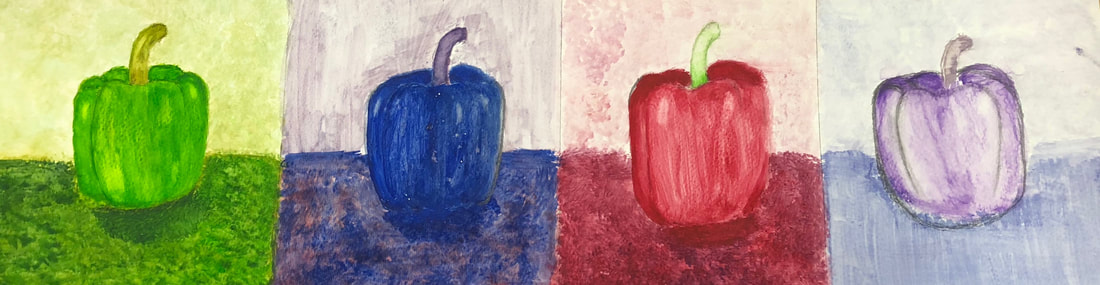
For this assignment I had to do a painting of peppers which had to be in different tones like cool-colors warm-colors etc. which I could choose from different techniques but only for. For the first pepper I decided to go with a cool-color. What I decided to do First was draw out the pepper lightly so I could know how I wanted to layer it out. I think the hardest part well I wouldn’t say it was that hard because I have done this in past art classes but what always gets me is not painting to dark and not to light. I also had to do the background to match the color of the pepper.
For the second pepper I decided to go with a warm-color which I added salt to get a different texture. I did the same steps as I did in the first painting the one thing I had difficulty with was not over adding to much salt and adding just enough. I feel like what the salt does to the painting is it makes it a bit blurry and it makes a better texture. For the background color I decided to go with the colors I used for the entire pepper which were blue and purple.
For the third pepper what I did was monochromatic. This one all I had to use was only one color you don’t have to use only one color. The colors I decided to go with was red and a bit of green for the stem. And since this is watercolor I had to make sure I didn’t over add water because if I did the paint would just spread out weirdly and then the texture just feel weird and the paper would start to peel off.
For the fourth pepper I decided to go with watercolor pencils because it would be easier to work with and the texture would be much better. If I had to choose one technique for this entire assignment I would use watercolor pencils because because it’s so much better and the one I least liked was monochromatic. For this assignment I think that’s the texture came out so smooth and I just had a bit of difficulty getting it smooth.
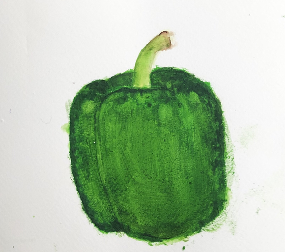
-This is my practice watercolor pepper I used a dark green so the pepper could look more realistic. I added a little bit of black so the pepper would have value.
- The first picture is the watercolor practice value chart for the shapes I lightly painted and added a dark blue to create the shadow making the other shapes 3 dimensional. - For the second picture is the practice of the different technique of using watercolor.
1.) What watercolor techniques proved to be effective in your painting? How and Why? - The water technique that was the most effective in my painting was "wet on wet" because my painting a lot of colors that where fading away and "wet on wet" was helpful because it mixed the colors more easily. 2.) How important was using transparent layers in your painting? - Using transparent layers in my painting was important because it added value to the painting. 3.) Explain how your composition was successful? Did you utilize all the elements of art and principles of design? Explain. - My composition was successful because I try to add texture and value to my roses by adding some dark colors and bright colors to it. To make the flowers look more realistic I tried to avoid making my flowers 2D. The shape of my roses didn't turn out quite like I wanted them to turn out but adding value to them helped a lot. 4.) was color choice an important factor in the overall success of the painting? Why? - Yes, color was an important factor in the overall success of my painting because adding dark purple and some blue to the flowers made the roses more realistic. Adding bright pink to some of the roses made the roses pop. 5.) Describe your craftsmanship? - I used watercolor like it suppose to be used and I also used watercolor technique like "wet on wet". 6.) If you were able to do something different what would it be and why? - If I were able to do something different I would try to fix the shape of the roses and make them look more natural. I also would do something with the background add more color to it because the background seems like it was rushed which it was. 7.) Explain to me what you learned about watercolor and how it has improved or discouraged your development in art? - What I have learned about watercolor is that I have to let the watercolor dry first to add more color. Another thing that I learned is that there are a lot of techniques that you can use for an example "wet on wet" "salt"and "dry brush". In my opinion I feel like I have improved using watercolor because I have practice.
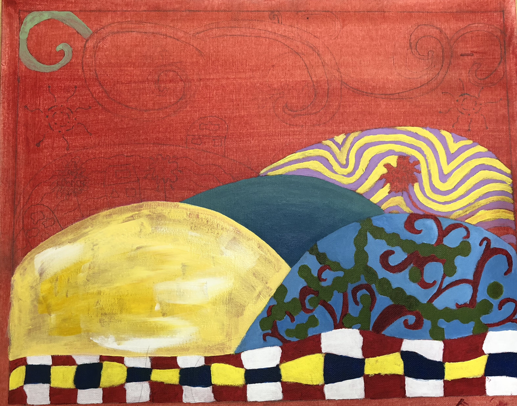
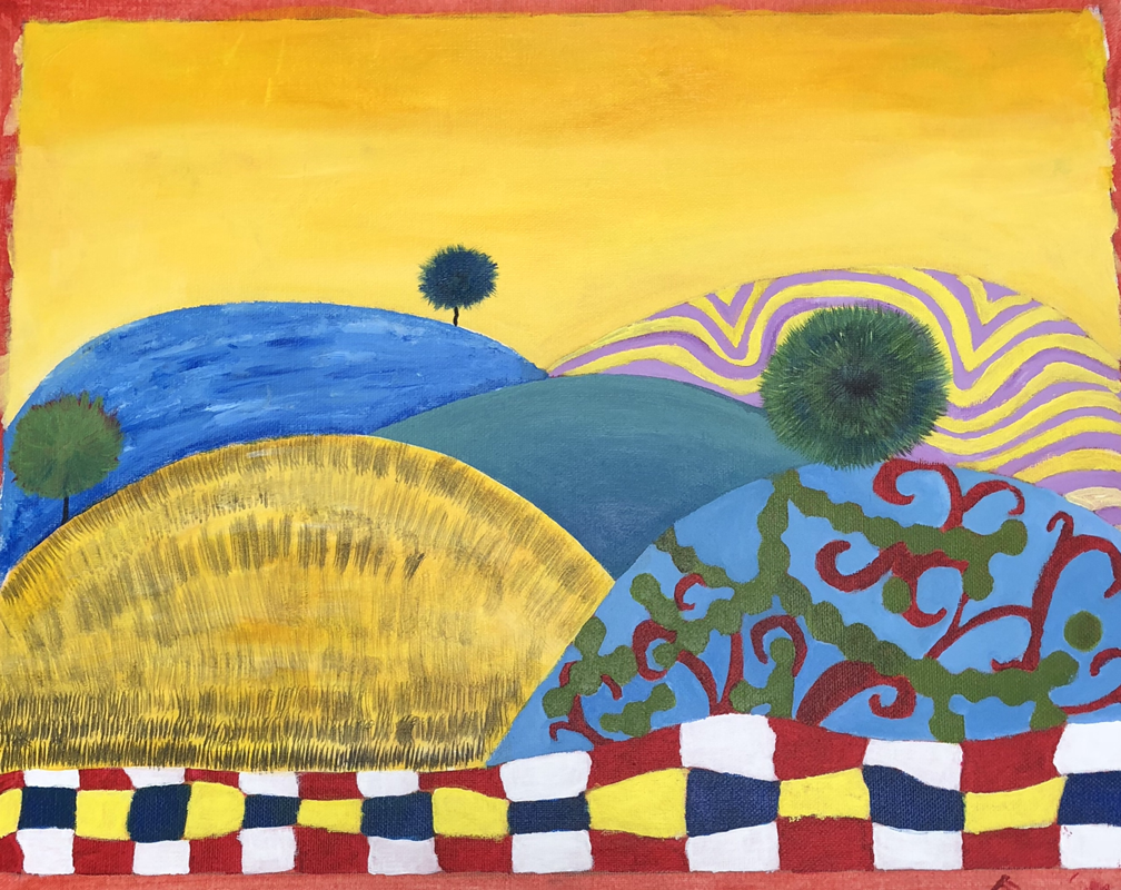
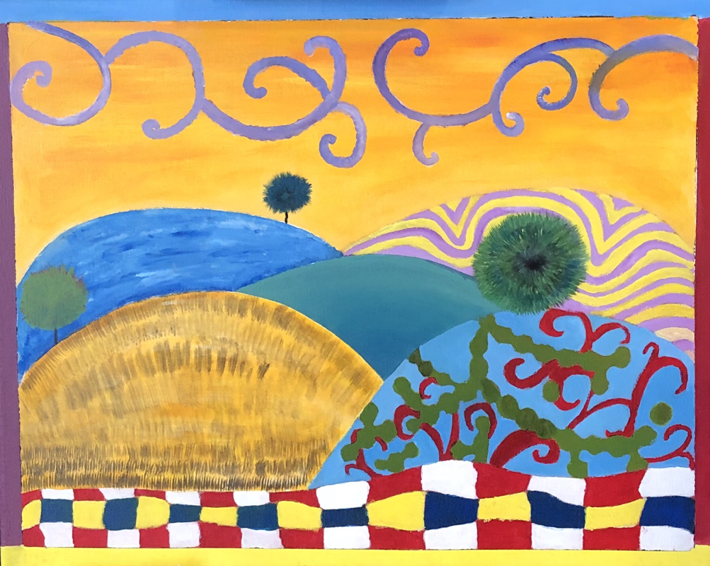
HUNDERWASSEN PAINTING
- These are my Hundertwasser sketches and the one I choose was my first sketch.
1. Describe the craftsmanship of your painting. (Is it neat and well executed?) The craftsmanship of my painting in my opinion was very neat and well executed. I wanted the colors and everything to flow together. 2. How does your work embody the artists style? My painting embodies the artists style by the bright colors I used and not using straight lines because the artists doesn't work with straight lines. I added weird lines and my trees I made them have like a furry texture. 3. Describe your choice of colors/color harmonies and how you used them throughout the artwork. The choice of colors I used for my painting were bright bold colors. I tried to add colors that work together the harmony of colors I felt like it gave it a Dr. Seuss vibe. 4. What is the emphasis (focal point) of your artwork? The focal point of my painting is the hills with the different texture of patterns added and the swirls on the sky. I feel like your eye glazes at everything in my opinion. 5. How did you use textures and patterns to embellish your artwork? The way I used textures and patterns to embellish my painting was adding textures that would make the painting pop like for example I like how the texture of the trees turned out and the pattern that I added to the sky made the sky not look so empty adding balance to the painting. 6. How did you put a border on your artwork? How does it enhance the work? They way I put a border to my painting was just adding bold colors that would flow with my painting. I didn't add any patterns to it because I felt like it was not going to balance. The border enhances my artwork by drawing attention to it more adding more harmony to it. 7. Describe any difficulties you had creating this artwork? I had many difficulties with this painting the first difficulty I had was thinking of shapes and patterns to my work I didn't want to add repeating patterns to it. I tried avoiding using the same colors as well not using soft colors because the artist used bold colors on his painting. Another difficulty I had was with the choice of color for the sky I wanted a color that flowed with the whole painting it took me about 4 tries to get this color I kept on repainting and repainting. It was very difficult when I kept doing the because the paint didn't dry that quick and when I kept adding paint the paint would blend together to the previous color I had.
- The first picture was using oil paint with a brush. In my opinion I feel like the using the brush seems to be more easier but turns out to be more difficult. The second pear is painted using oil paint with a palate knife using the palate knife was much easier in my opinion. I like how the background and the shadow of the pear turned. Although using the palate knife can be a little tricky because I had a hard time painting around the pear but overall I liked the technique of using the palate knife.
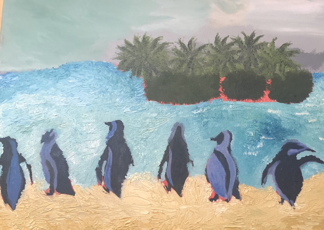
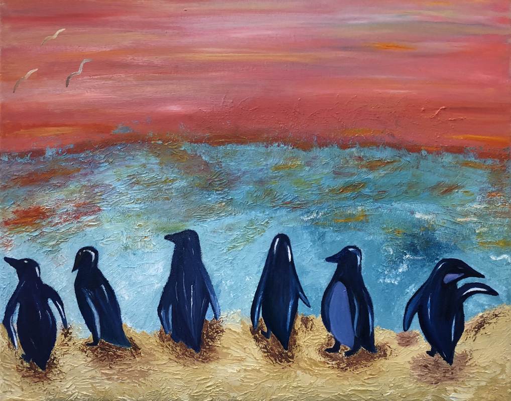
LANDSCAPE PAINTING
1. Describe the craftsmanship of your painting. (Is it neat and well executed?) At first my painting wasn’t turing out how I wanted to. But then adding the highlight and shadows to the penguins made the painting look a little realistic. Adding the reflected sunset to the water was a good decision. So in my opinion I feel like my craftsmanship on this landscape was well executed.
2. Describe your choice of colors/color harmonies and how you used them throughout the artwork. My choice of colors were well planned out at the beginning I wasn’t sure what I wanted to do with the sky but then I decided to do the sketch and plan out the colors as we were asked to do. But adding the highlight and shadows to the penguins made the penguins pop out more adding highlights to the sky and water made it look more realistic. I decided to add the reflection of the sunset to the water so it can add harmony to the painting.
3.How did you create contrast in your painting? I created contrast in my painting by adding highlights and shadows on the penguins and water.
4.How did you apply textures, highlights and shadows to enhance your artwork? I applied texture to the water by adding different types of shade of blues. Applying the highlights and shadows to the penguins made the penguins more realistic.
5. How were you able to create depth in your painting? I was able to create depth in my painting by adding dark purples and dark blues to the penguins. Also adding the shadows made the painting have more depth.
6. What painting techniques did you use that made your painting successful? I painted my water using the pallet knife at first I wasn’t pretty convinced I could do it because I’ve never used the pallet knife technique or ever used oil paint before but overall I think it made a huge different giving it a sort of water texture to the water as you can see in the background. I decided to make the water splatter like waves using the pallet knife making my painting successful.
7. Describe any difficulties you had creating your drawing and what you could do to improve your drawing? When starting my painting I saw that adding trees to the background didn’t flow with the overall landscape also the colors I used for the background wasn’t turing out how I wanted it to. But just dealing with the colors at the start I had a difficult time.
8. Explain the successes you had with this painting. In my opinion I felt like I was very successful with this painting. I think that this is the most successful thing I have done in art. Looking back at previous painting I have done they aren’t that well but this one is just something I am very proud of.
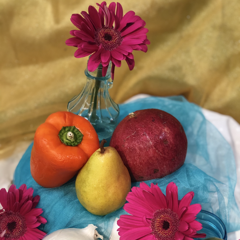
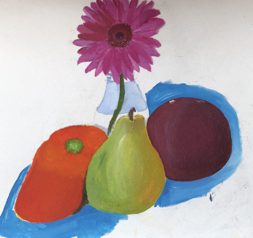
oil still life
The first picture is the original picture that I had to paint with oil paint. I didn’t quite finish this project but in my opinion I feel like I had a hard time with the blending the colors I tried not to mud the paint but it was difficult.
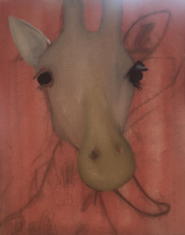
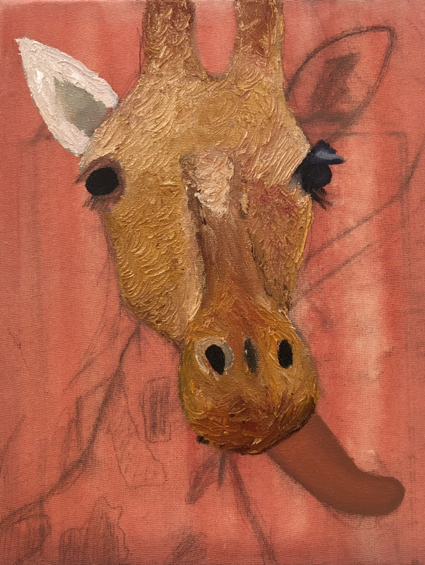
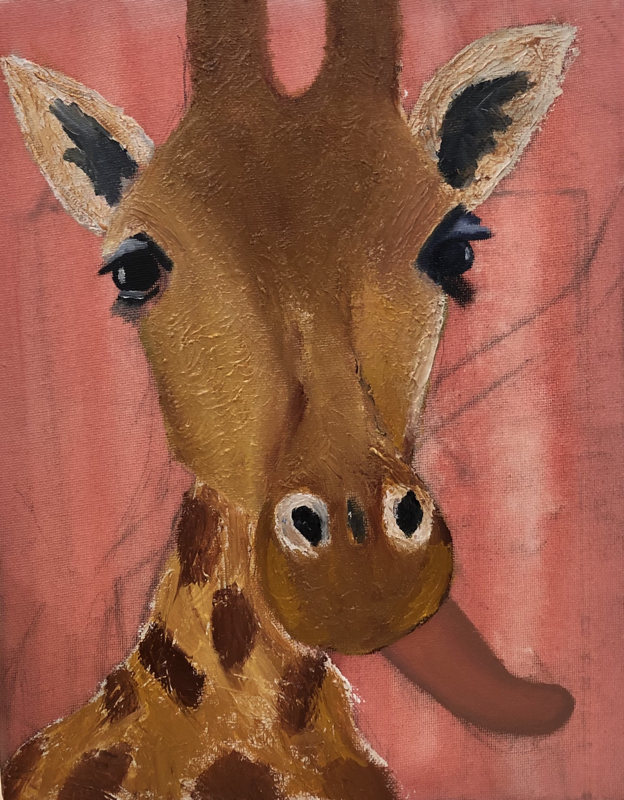
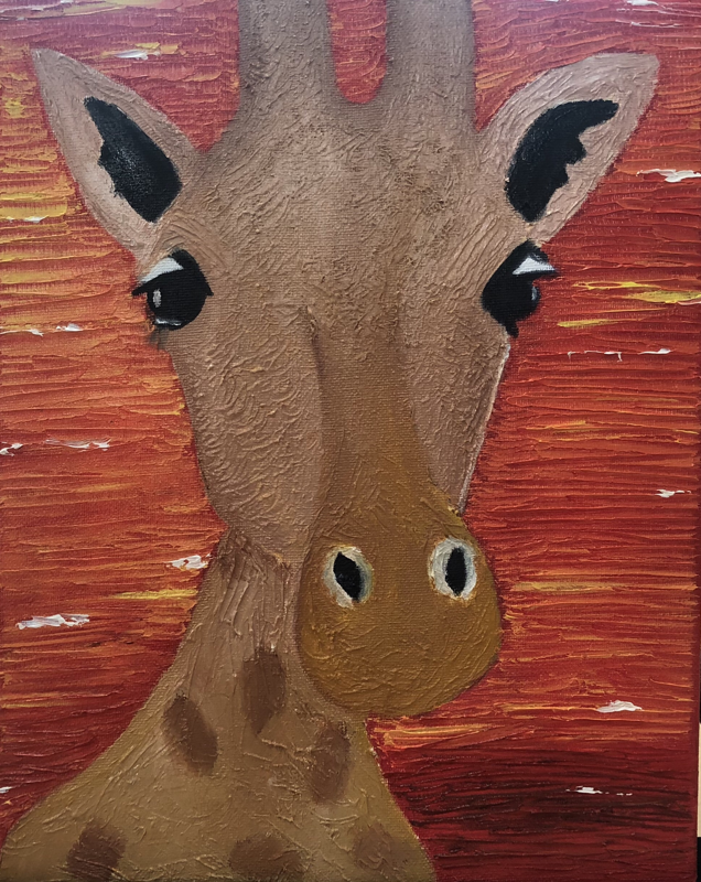
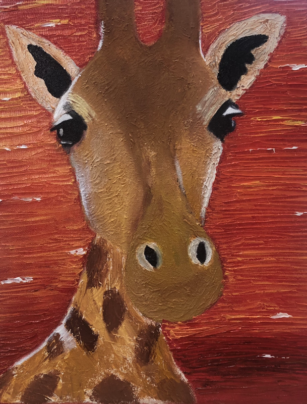
Animal Portrait
1. I felt like I did a good an well executed job on this painting. I had the choice of using acrylic or oil paint but I decided to use oil paint instead because I felt like oil paint adds more texture to your painting rather than acrylic. The colors used on my giraffe worked perfect with my background. I love how my background turned out I used the pallet knife to do my background to add the strokes of red and yellow. I added highlights to the giraffe to make the giraffe look more realistic and also give it depth and value I also added highlights to the sky. Overall I felt like I did a good job on this project. 2. I felt like my painting had a successful turnout because the value it added to the giraffe by adding highlights and shadow to it made the giraffe look more realistic. I used a lot of layers of reds and orange to my background using the pallet knife gave it a good texture to it. The blending of colors on my background makes it look like a sunset which was what I was going for and it turned out as I planned. The giraffe gives the background great aesthetic vibe because of how the colors of the giraffe and background are balanced together. 3. Using pallet knife for my background I felt like it was a creative technique to use while using oil paint because it added a nice and neat textures to the background which is a sunset because I could add yellow and orange highlights. At first using the pallet knife technique was a little difficult to use I got the hang of it and i love using it. Also adding liquin to the colors your going to use makes the colors look more smother and softer. 4. I felt like these 2 projects which are the landscape painting and pet portrait turned out better than I expected I felt like I have improved in blending colors together. 5. The craftsmanship and quality of my artwork were both well balanced together the technique I used were the pallet knife technique and using the liquin to enhance my painting helped a lot. Also by using the liquin it gave a nice soft quality to the painting.